BMS brings together bookings from OTA channels, properties, owners, services and reports. The frontend is on Vue and PrimeVue, so I build screens from canonical PrimeOne components plus a few of my own. Development often runs ahead of the mockups, so they often need syncing. Talking to users isn’t possible; the analyst writes the specs, so I rely on the spec, the API and what already works.
All projects
B2BEnterpriseVuePrimeVueProduct design
BMS
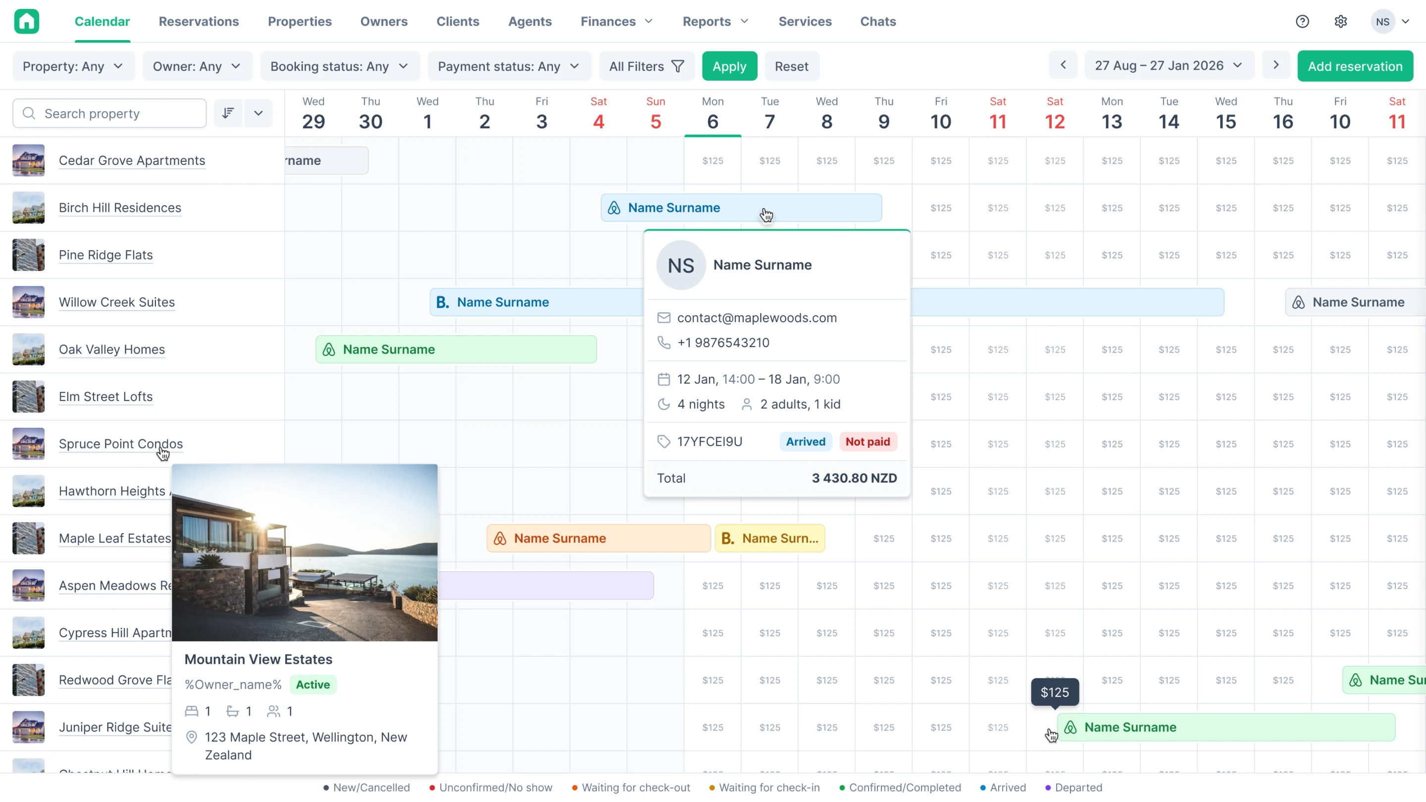
A system for rental property management companies: bookings, properties, owners, finance. I joined the product in January 2025 and have been leading design on my own since April 2026. Two deep dives here: money in a booking and making the whole system work on tablet and phone.
Context
A system where every booking has its own money
StackVue, PrimeVue
ThemeLight + dark
RoleSolo since April 2026
ScopeUX and guidelines
What’s inside
Two deep dives
Tasks in BMS come ready-made, and my part is to think through everything the spec doesn’t cover: edge cases, errors, what happens on a phone. Below are two such tasks.
Deep dive 1
Money in a booking
The booking page has to show how much the stay costs, how much is already paid and what to do if the booking changes. There are many amounts and they’re all about different things: paid, consumed, paid in advance, debt. If a manager can’t tell at a glance whether the guest owes money, they’ll either refuse check-in for no reason or check the guest in with a debt.
Three summary lines
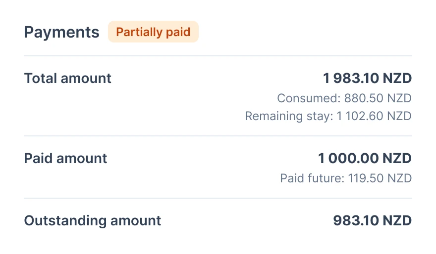
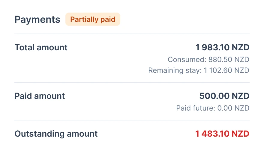
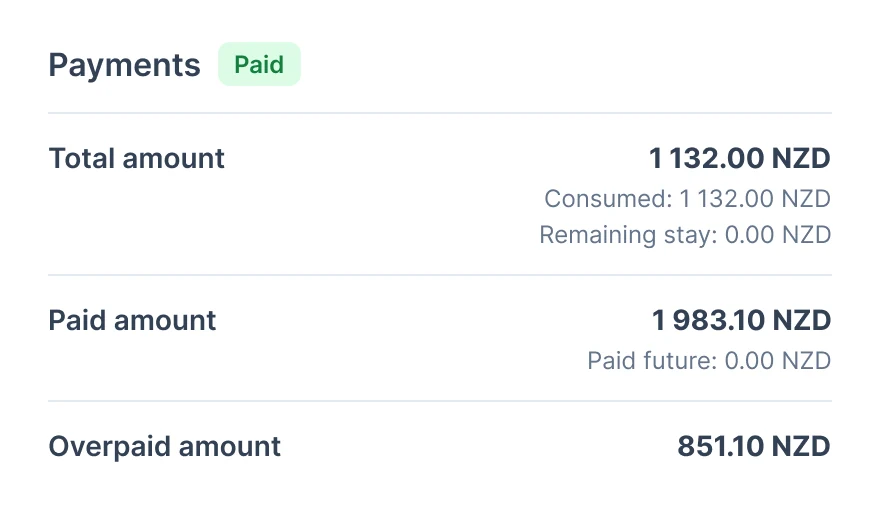
At the top there are three amounts: what the booking costs, how much is paid and how much is left. Under the total, in small print, how much the guest has already consumed and how much of the stay is left. Under the payment, how much is paid in advance. If the guest overpaid, we show the overpayment instead of the debt. The debt is red only when the guest has consumed more than they paid: a booking not paid in advance is normal, no need to raise alarms over it.
Principle
Red only for what needs action. A booking not paid in advance isn’t a debt yet.
Price per night
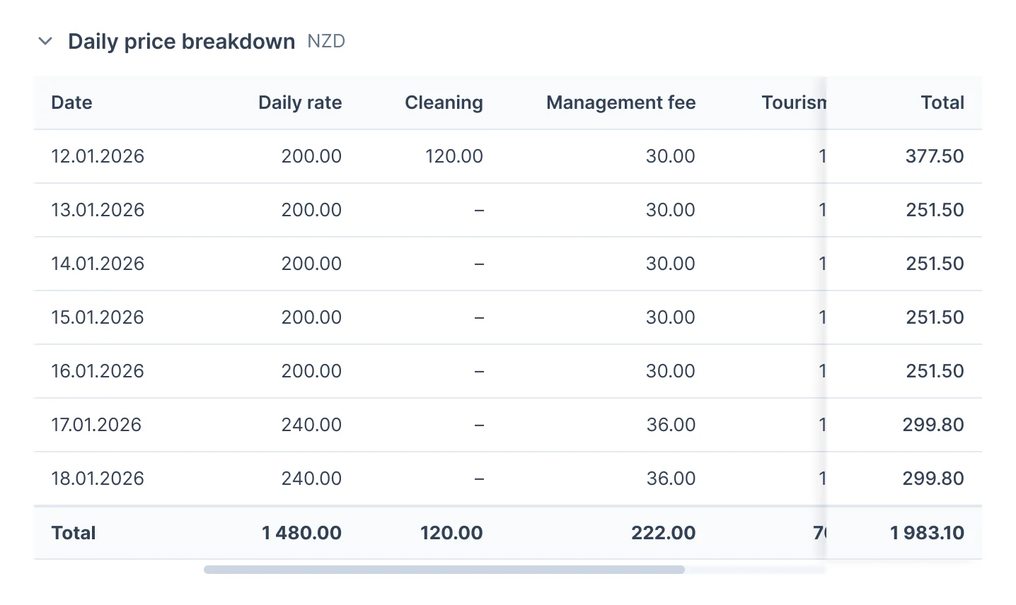
Under the price there’s a breakdown by night. Columns appear only for the fees present in this booking; date and total are pinned, the rest scrolls sideways. Up to ten nights the table is full height; longer ones scroll inside, so a month-long booking doesn’t stretch the page. While designing, I noticed the API returns only the base price and the management company fee per day. I wrote this down in a note for the backend: without the other fees, the rows won’t add up to the booking total.
Adjustment without surprises
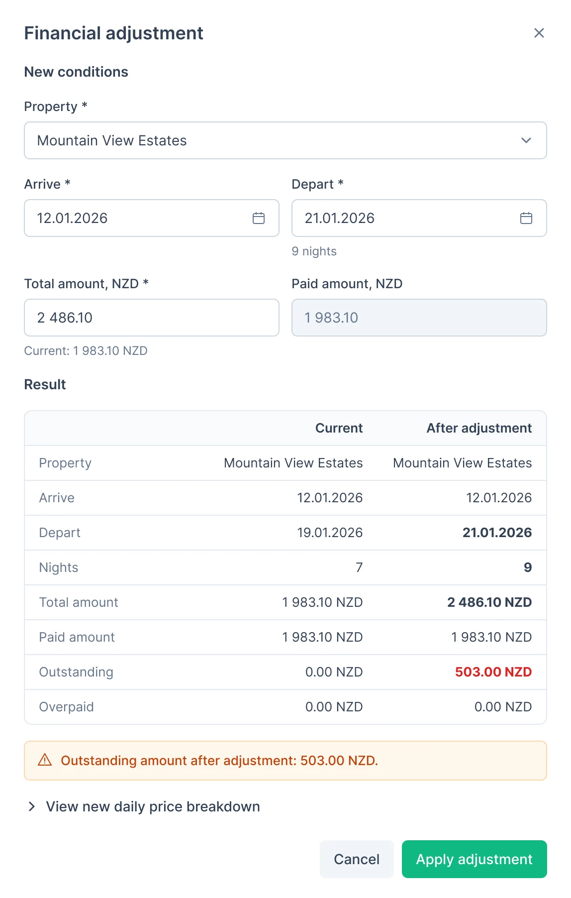
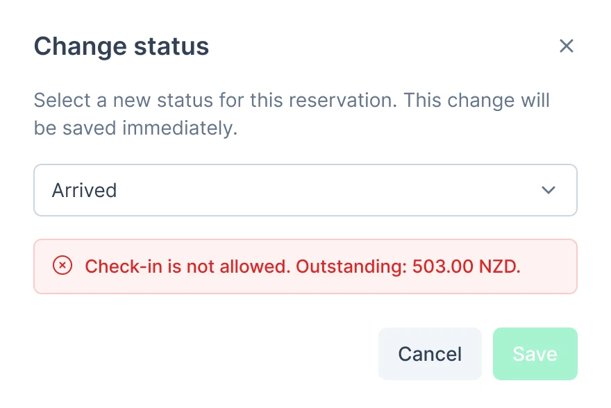
If a guest’s booking is extended or they’re moved to another property, the amount has to be recalculated. The adjustment window has the new terms at the top and a “before and after” table below. The backend recalculates after every change but saves nothing until you press Apply. Changed values are bold, debt is red with a warning. On overpayment we say that a refund won’t be created automatically, so nobody thinks the money has already gone back to the guest. Whether a guest can check in with a debt depends on the property setting: if not, Save is disabled and the debt amount is visible.

Deep dive 2
Adapting for tablet and phone
The system was designed for desktop. The task was to make it usable on tablets and phones: navigation, tables, filters, cards, calendar, modals. Development had already started building, so first I went through the dev build at 375 and 768 px and sorted out what was broken there, and only then sat down with the mockups.
First I moved the breakpoint
The system already had 600 px frames, and the mobile breakpoint was there. But 600 is basically a phone too, and a 416 px side drawer doesn’t fit on it. I moved the breakpoint to 768: up to 767 is mobile, up to 1023 is tablet, from 1024 desktop stays unchanged. I updated the breakpoint guide to match.
Mobile0–767 px
Tablet768–1023 px
Desktopfrom 1024 px
before: breakpoint at 600now: 768, the 416 px drawer only fits from hereNavigation
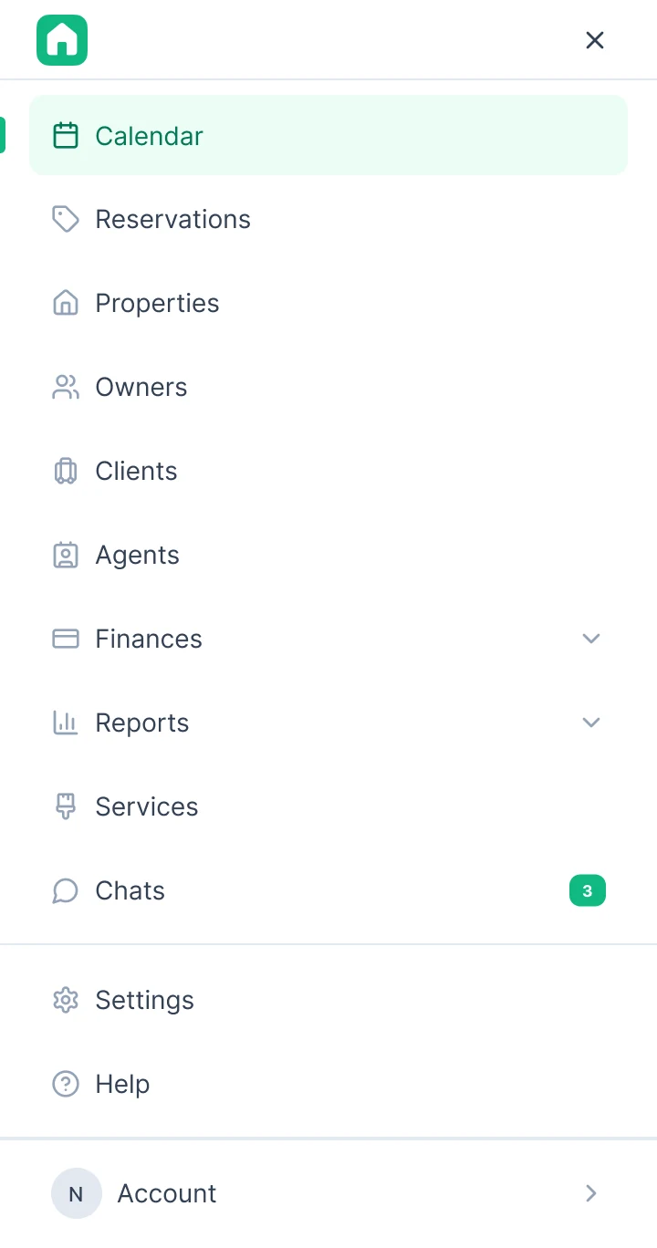
Below 1024 the nav bar is replaced by a header with a burger. Copilot moved into the header, there’s no floating button on the phone. On pages with a sidebar, a section button next to the logo opens it. Unread chats show as a red dot right on the burger. On a tablet the menu slides in as a panel from the left, on a phone it’s full screen.
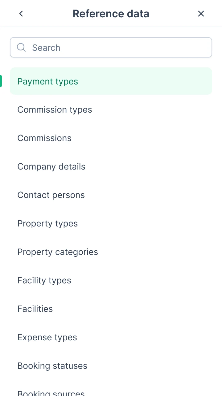
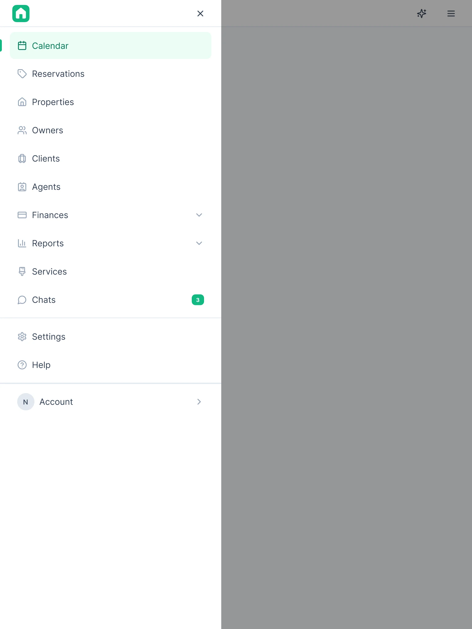
Tables and filters
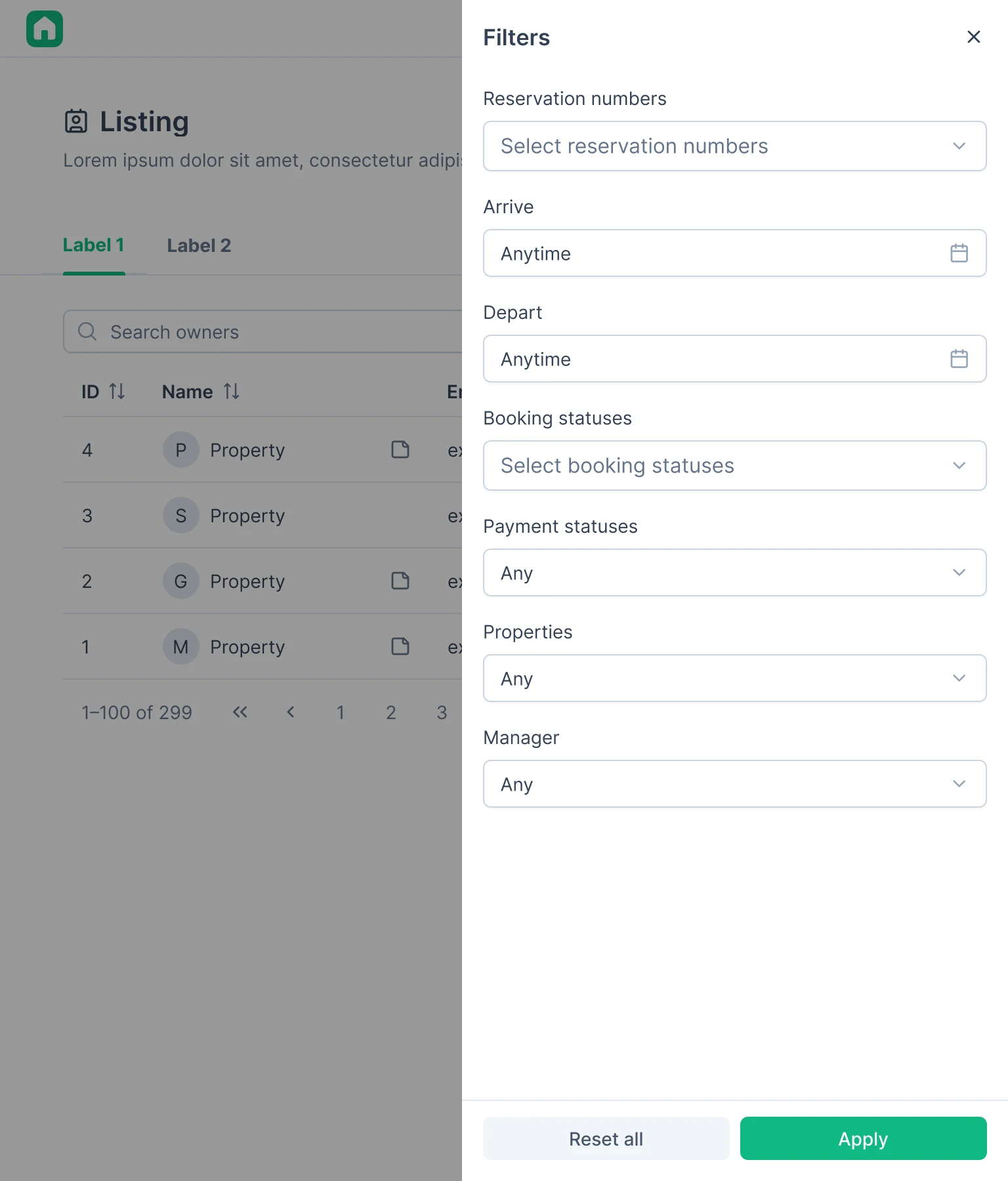
I didn’t turn tables into cards: horizontal scroll appears once columns reach their minimum width. I moved the paginator out of the scroll area; on a phone only its arrows remain. Below 1024, filters hide behind a button with a counter and open the same All filters drawer as on desktop: from the bottom on a phone, from the right on a tablet. Applied filters show as chips in one row.
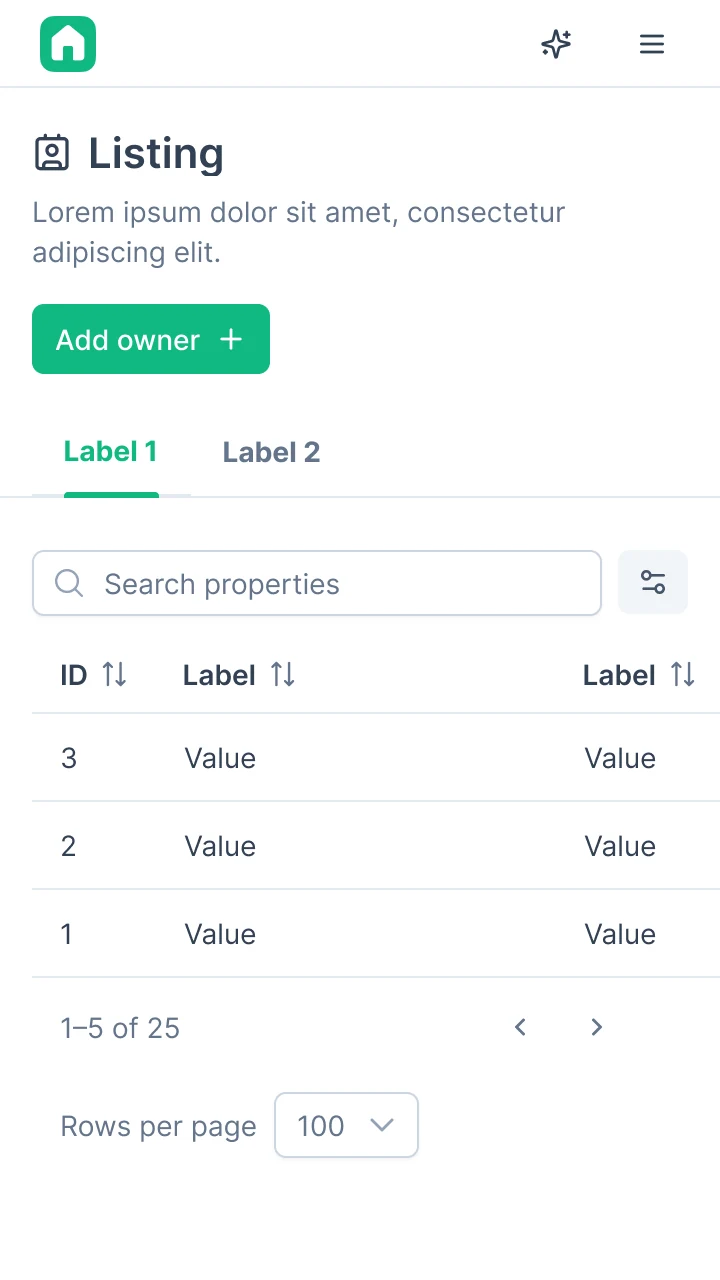
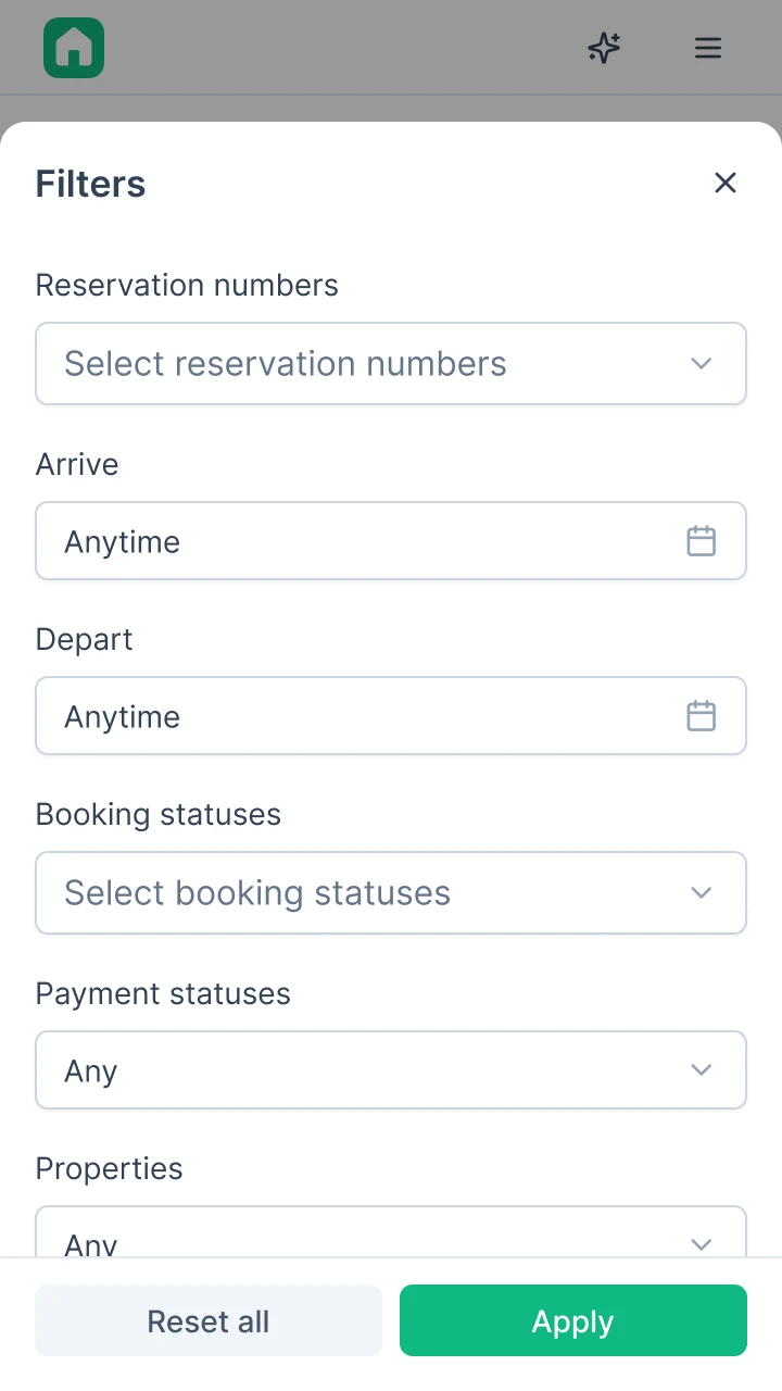
No room for the card
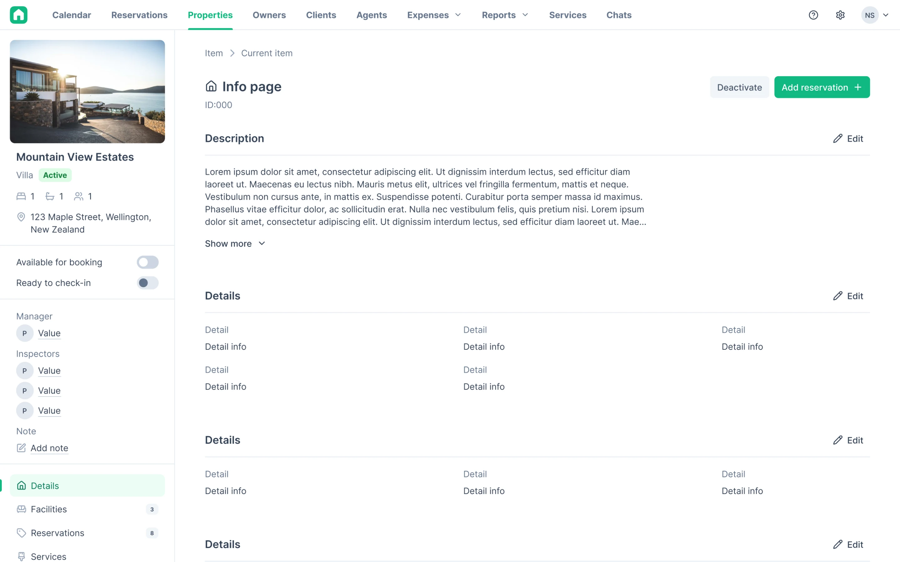
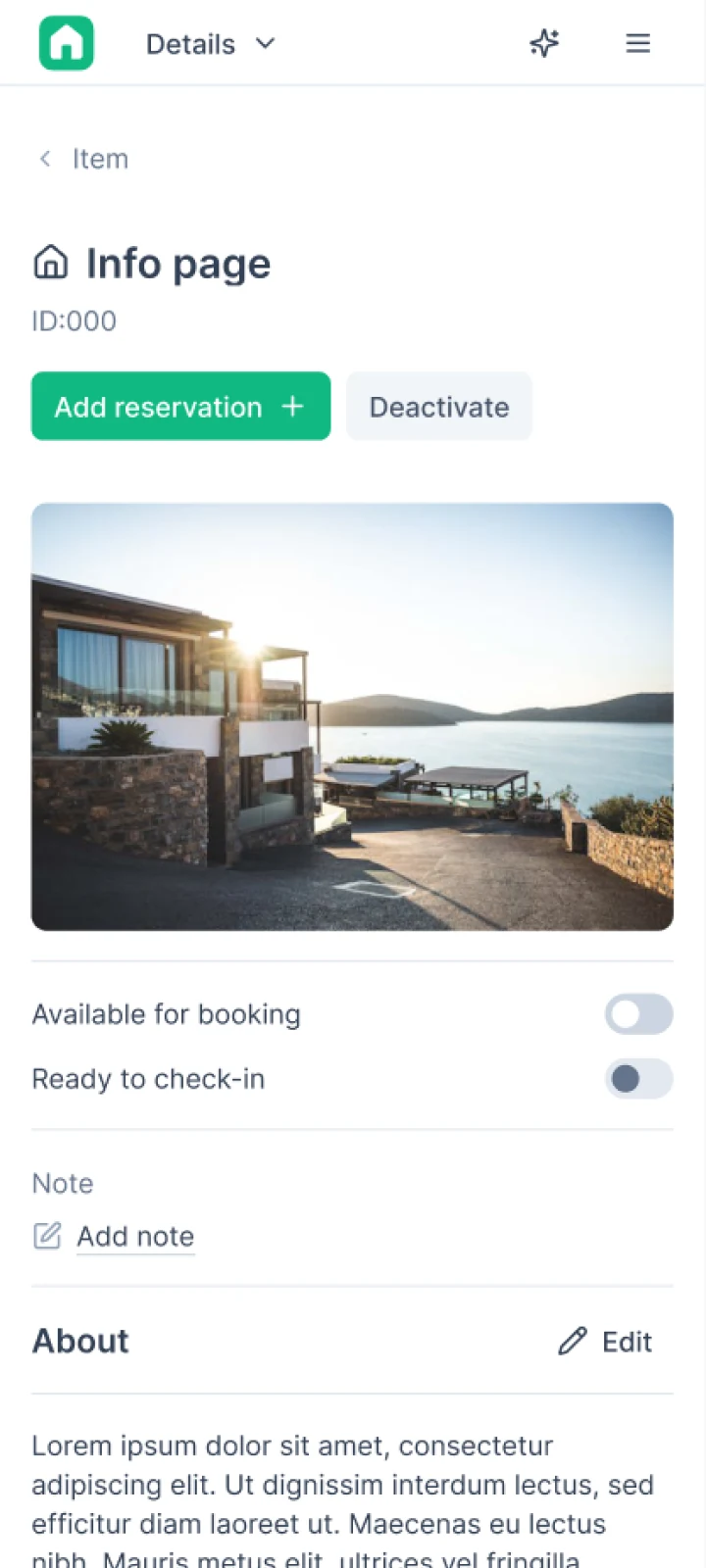
On desktop there’s a property card to the left of the details. On a narrow screen there’s no room for it, and almost everything in it repeats the header: name, status, address. So we move to the top of Details only what isn’t anywhere else: for a property the cover, two toggles and the note; for a booking and an owner just the note.
Outcome
What development got
Money in a booking is already released: all payment states, the price breakdown by day and the adjustment window with every error. For responsiveness, the system got breakpoints, mobile navigation and rules for tables, filters, cards, the calendar, modals and drawers. Touch rules for fields and buttons are still in progress.
What I’d do differently
For money in a booking, I’d suggest the team think through edge cases at the spec stage, not once development is already underway. And for responsiveness I lack analytics: which screens are used most and from which devices. With that I’d have started with the most needed sections, not all of them in a row.