The team uses Back Office to look up customers, cards, transactions, logistics and promo codes. Developers built it as needs came up; there was no designer involved. For now it’s used internally, by developers and QA. But support and white-label partners are coming soon, and they need an admin panel they can figure out on their own.
All projects
FintechInternal toolProduct designWeb
Back Office
I audited BitcoinOX’s internal admin panel: 22 sections, five different ways to filter, and customer data shown as raw JSON. Instead of redrawing every screen, I wrote rules, and screens are now built by them.
Context
An admin panel built without a designer
Admin sections22
Cross-cutting issues14
Guideline sections6
Audit and solutions2 days
Task
Turn 22 screens into one system
The task was a full audit and solutions for the whole back office at once: menu, header, filters, tables, activity log. The constraints were set from the start. Two roles, admin and operator. We don’t merge screens, we leave RTL for later, and everything is agreed with the team before development.
How I worked
Understand first, then draw
Before any mockups, I gathered facts from three places: what an employee sees, what the frontend actually does and what the backend can do. The most interesting things turned up exactly where they didn’t match.
Three sources of facts
I went through every section on the test environment and captured each screen twice, empty and with a test customer. Then I dug into the frontend code and network requests, then into Swagger. There are 58 endpoints, and the frontend doesn’t use 16 of them at all. I went through the code and Swagger with AI, and used it to prepare the interview script for QA and support too.
Source 1
What an employee sees
I went through every section on the test environment and captured each screen twice: empty and with a test customer.
22admin sectionsSource 2
What the frontend does
Frontend code and network requests: what a screen actually requests and what it shows from that.
Source 3
What the backend can do
I went through Swagger with AI. Half of the interesting stuff was where the frontend and backend don’t match.
16 of 58endpoints unused by the frontend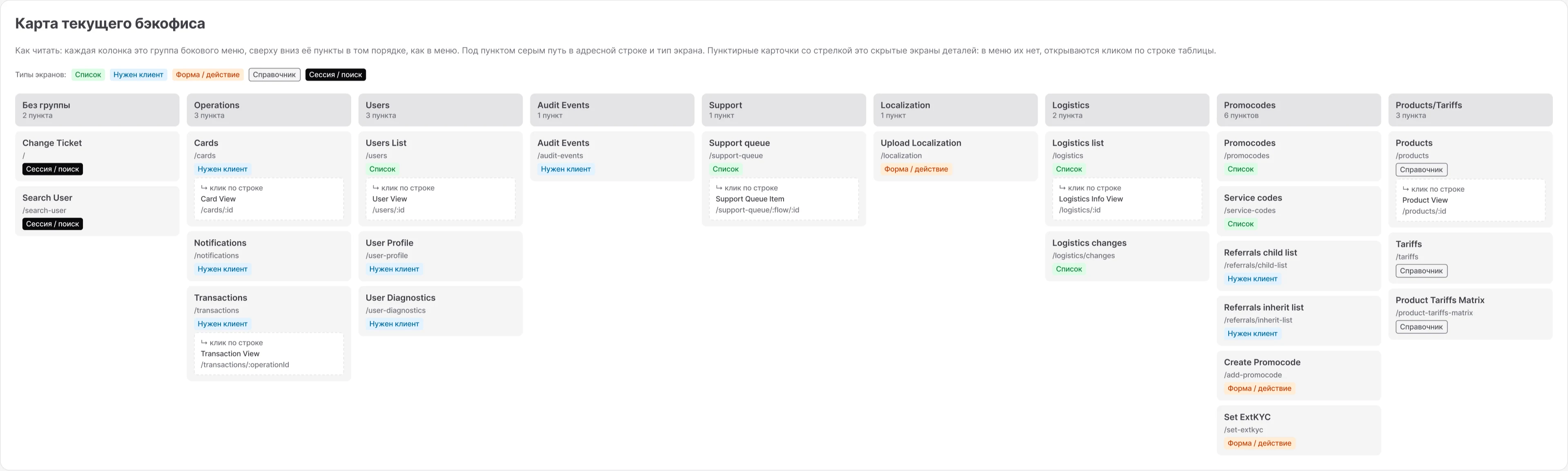
What I found
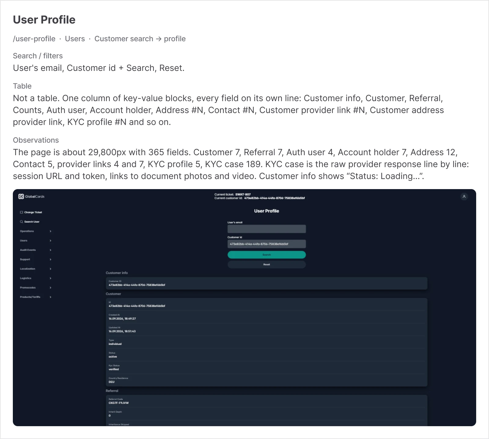
Individual screens weren’t that bad; the problem was that there were no shared rules at all. Customer search was repeated on 9 screens, and there were five different ways to filter. The customer profile stretched to 29,800 px and 365 fields, half of them a raw KYC provider response. And the backend already had admin and operator roles, the interface just didn’t know about them.
9screens, each with its own customer search
5different ways to filter tables
365fields in the customer profile, 189 of them a raw KYC provider response, session token included
2 rolesadmin and operator already exist on the backend, but the interface doesn’t know about them
Principle
If the same problem sits on ten screens, it’s easier to close it with one rule. Then the developer builds the next screen without me.
Solutions
What we changed
We kept the skeleton: dark theme, sidebar with groups, header with the ticket. I aimed for the most value for the least frontend work, so for every change I gave an estimate right away, S or M.
Navigation and customer context
There were eight menu groups put together at random. Now there are seven groups by entity, with customer search separately at the top. One field in the header replaced nine search forms; the found customer sits there as a chip and is cleared in one place. Routes stayed the same, so it’s mostly menu config and CSS changes.
Header
One search field instead of nine forms. The found customer sits as a chip and is cleared in one place
Before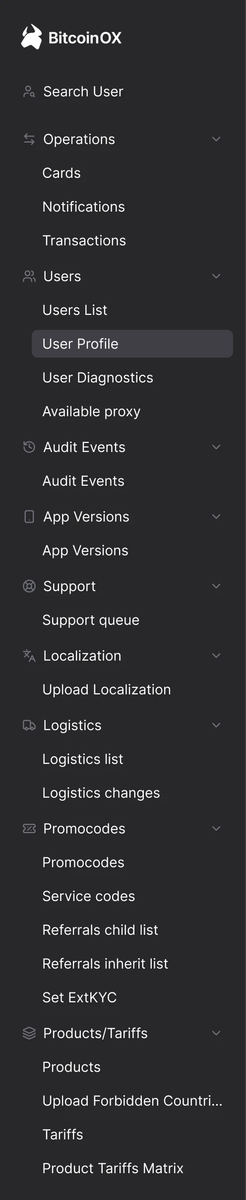
Eight groups at random
After
Seven groups by entity
Tables and filters
Column width now depends on what’s in it. Statuses are always tags, and sorting only where the backend supports it. All filters live in one panel above the table. We argued here: the team wanted a simpler option, I pushed for the more advanced one. PrimeReact supports it out of the box, the frontend effort is about the same, and it’s much easier to use.
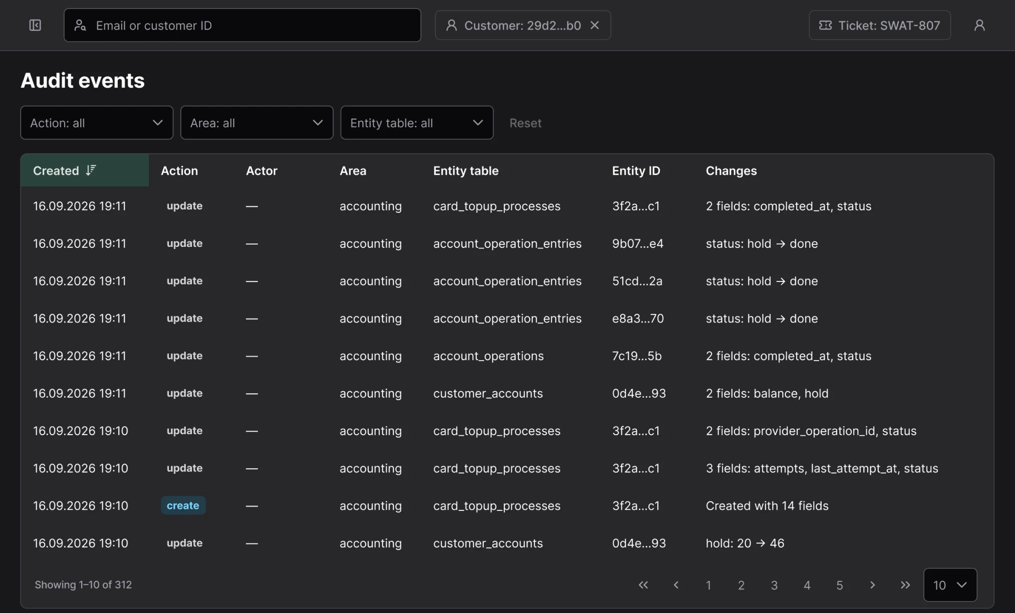
- All filters in one panel above the table, Reset next to them
- Action as a tag, not plain text
- Sorting only by Created, which the backend supports
Data screens without raw JSON
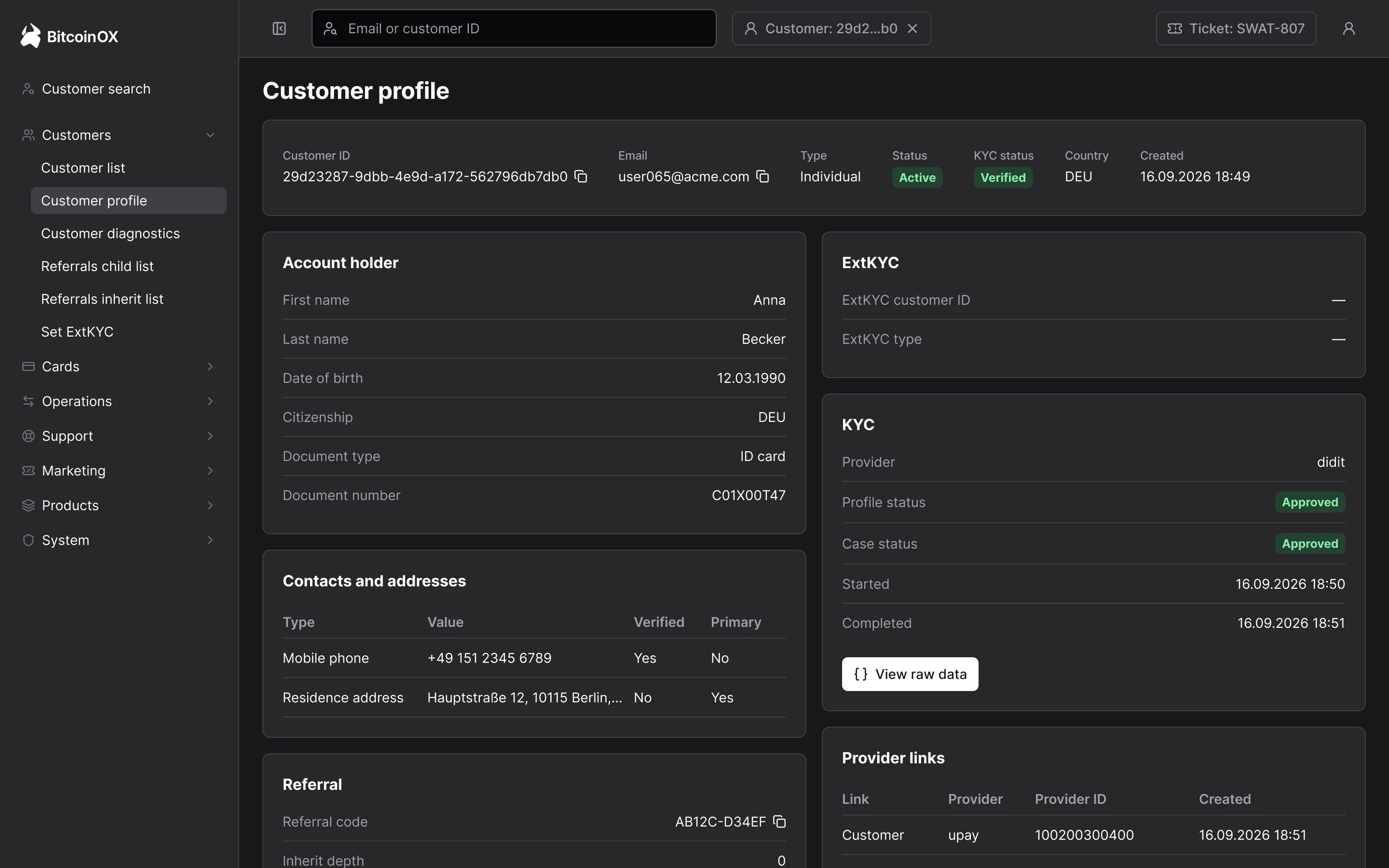
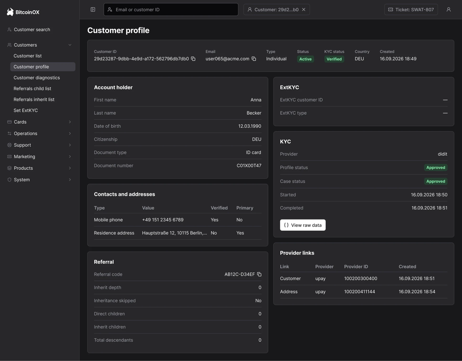
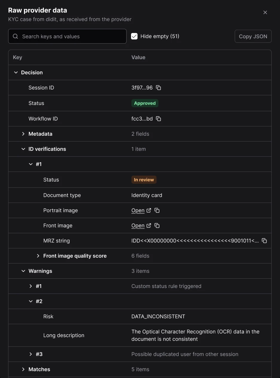
I laid out the customer profile as a summary at the top and two columns of cards: who it is on the left, statuses and links on the right. I removed the raw KYC response from the page entirely. Only an admin can open it, in a separate window with a tree, search and hiding of empty fields. An operator simply doesn’t have that button.
States, forms and the log
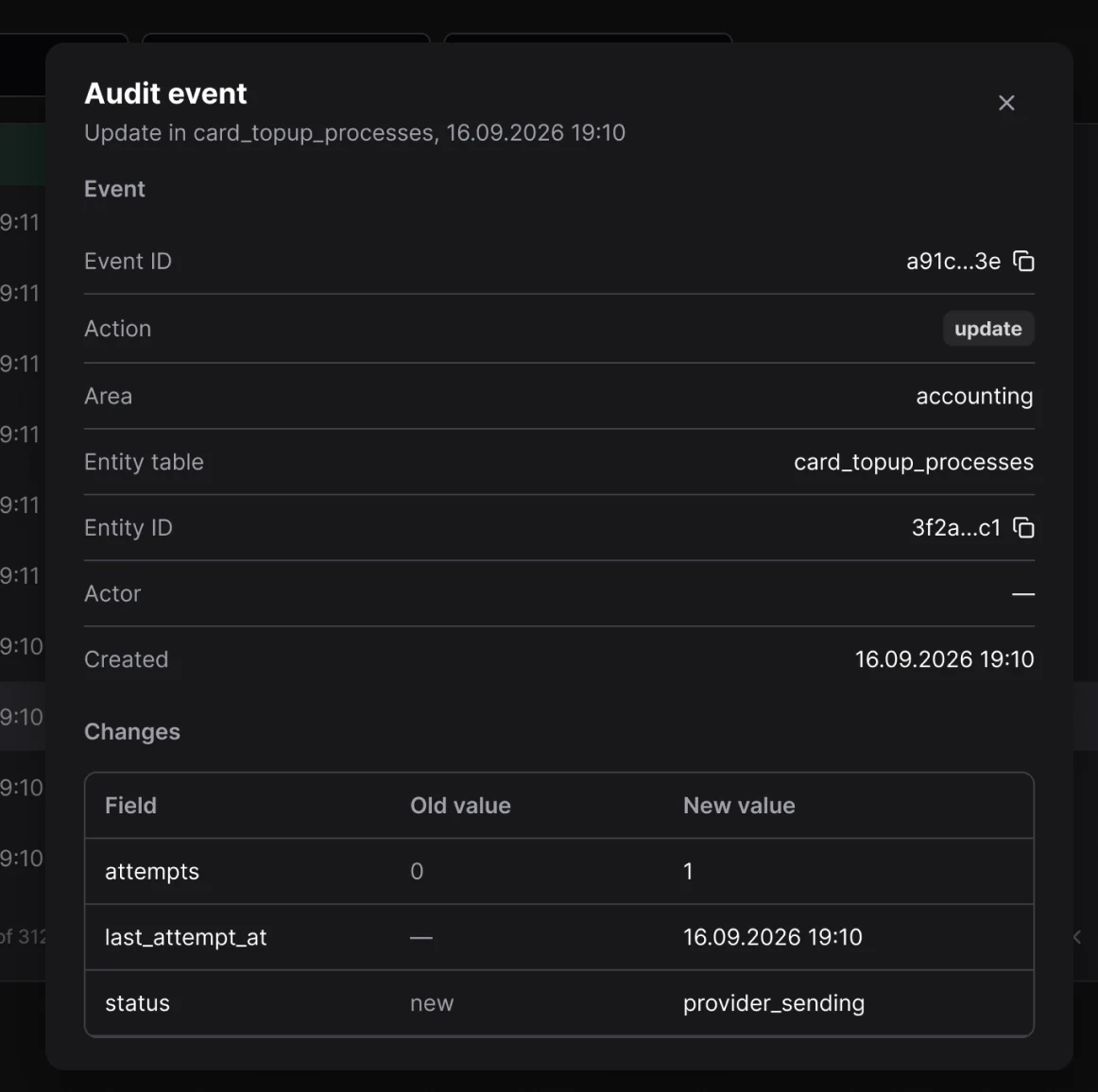
One empty state component for all tables: no data yet, nothing found, select a customer. If something fails, rows already loaded don’t disappear. In forms, the button is named after the action, and if the operation will overwrite data, you can see above the button exactly what will change. The activity log now shows one row per event with a short summary of changes, and details open on click.
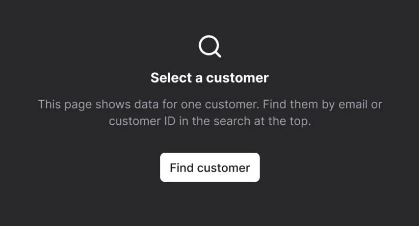
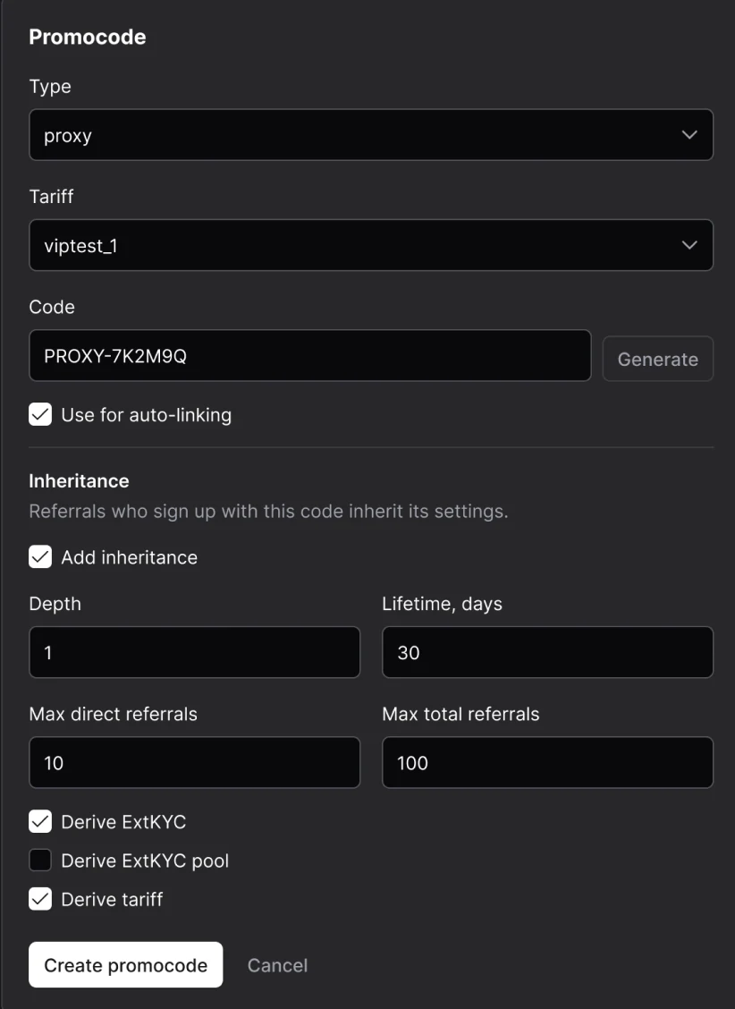
- One empty state component for all tables: no data, nothing found, select a customer
- The form button is named after the action, not “Set”
- Log: one row per event, details in a window on click
Outcome
All in production, and work got easier
We rolled it out in steps: navigation first, then the rest. In the end everything I proposed was implemented; now we’re only discussing a small reshuffle in the menu. According to the team, work has become more comfortable, with fewer clicks and extra moves.
Takeaways
In internal tools, problems often live between the backend and the frontend. Roles and search had been in the API for a long time, they just never made it to the interface. If I hadn’t dug into the code and Swagger, I’d most likely have just redrawn the screens. And one more thing: when every change has an S or M next to it, there’s almost no arguing about “like it or not”.