BitcoinOX
A crypto wallet inside a card product: hot wallet, cold storage and a card in one clear UX.
Context
Crypto without the fear of complexity
BitcoinOX sits between crypto and familiar banking: a hot wallet, cold storage and a card in one app. I led design as the core designer — from structure and navigation to specific flows, microcopy and edge cases.
- Screens to MVP
- 40+ screens
- Key flows
- 10 flows
- Theme
- Dark, from scratch
- Ownership
- Whole product UX
Goal
Combine wallet, storage and card into one clear product
Crypto scares people with complexity and the cost of mistakes. I had to connect a hot wallet, cold storage and a card so that a user with no crypto background wouldn’t get lost — without sacrificing control or security.
What I did
Designed the whole product — flows, settings, states
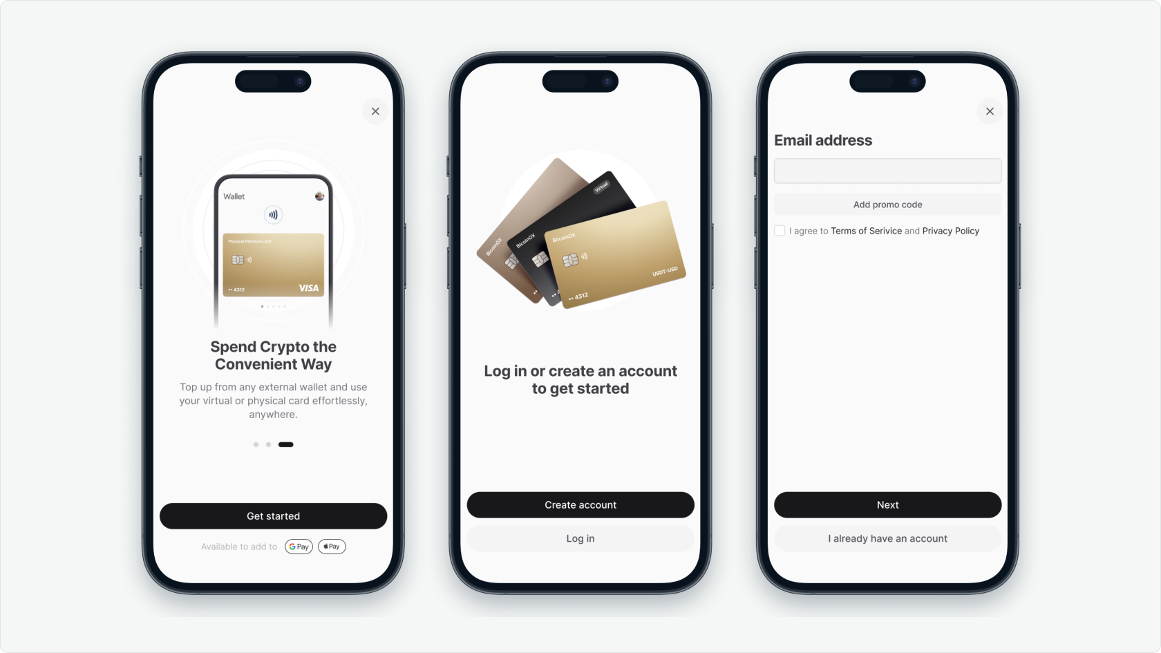
Sign-up and onboarding
Designed the registration flow with microcopy in an English fintech tone. Separately worked out the placement and wording of the promo/referral code field — so it wouldn’t get in the way of the main path, yet stayed visible to those who need it.
Settings architecture
Built the wallet settings — Base Unit, address format and other parameters — with a clear hierarchy and a single rule for editing.
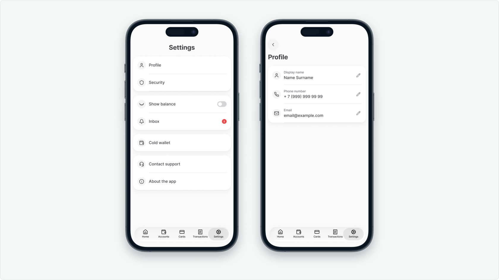
Principle
No chevrons. A pencil only on editable entities: the user always sees what can be changed and what can’t.
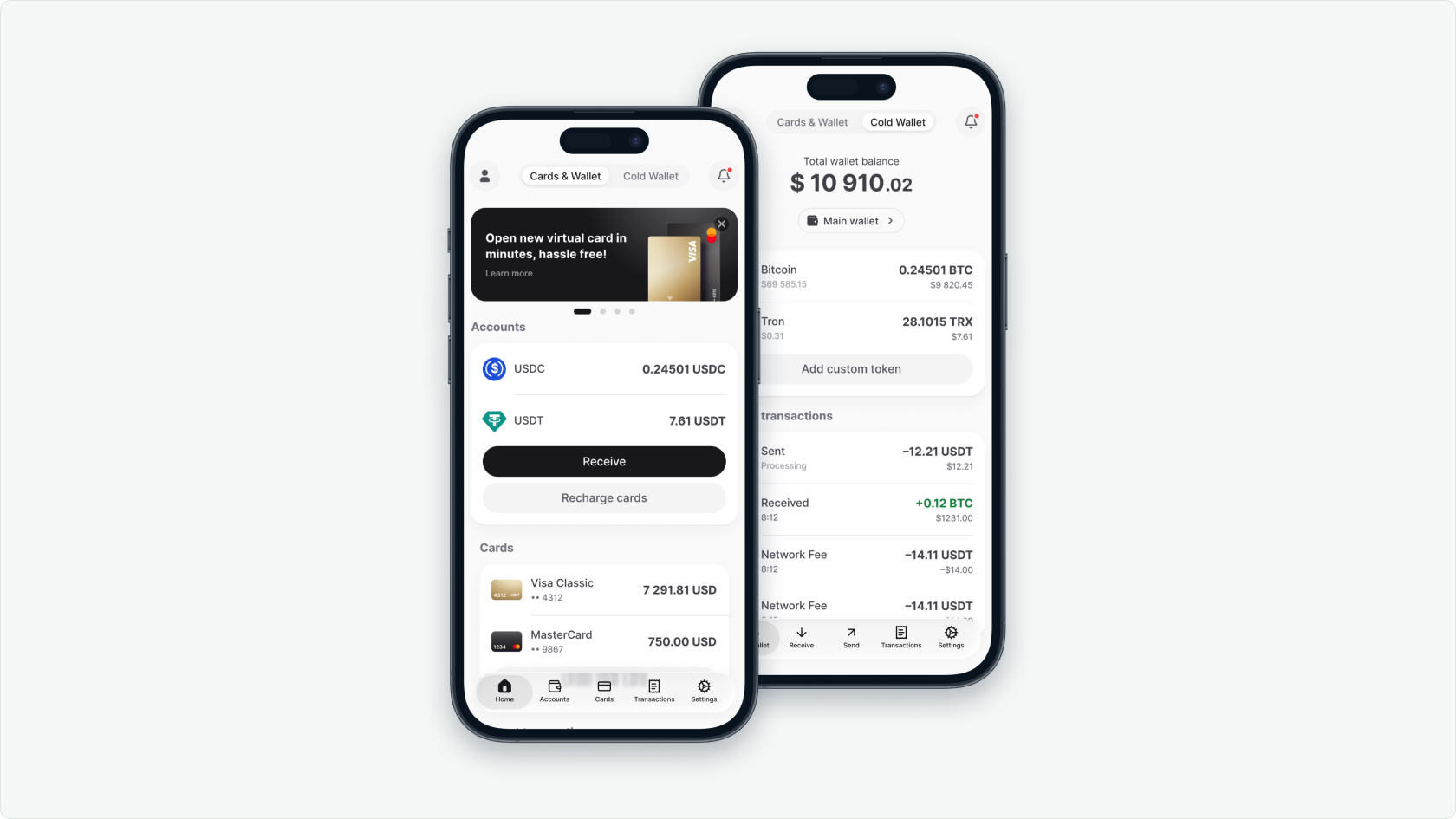
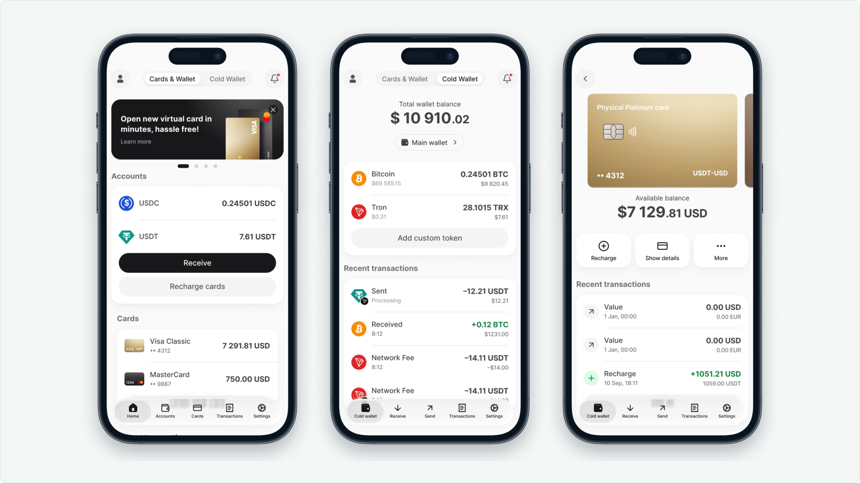
Wallet, cold storage and card — in one UX
Studied competitors (all-in-one: hot and cold wallet plus a card) and built a single scenario where moving between storage and spending doesn’t break context and keeps a sense of control.
Outcome
A clear crypto product with predictable patterns
40 screens and 10 key flows for the MVP launch, a unified visual language and repeatable patterns: the editing rule, well-designed states, a dark theme.
What I’d do differently
I should have locked the rules into a design system and tokens from the start instead of rebuilding patterns on every screen — and run the microcopy past real users earlier.
Next
Next project